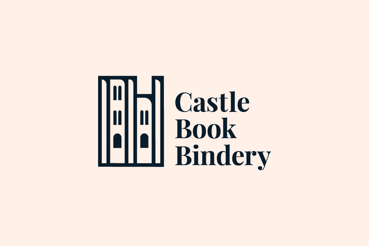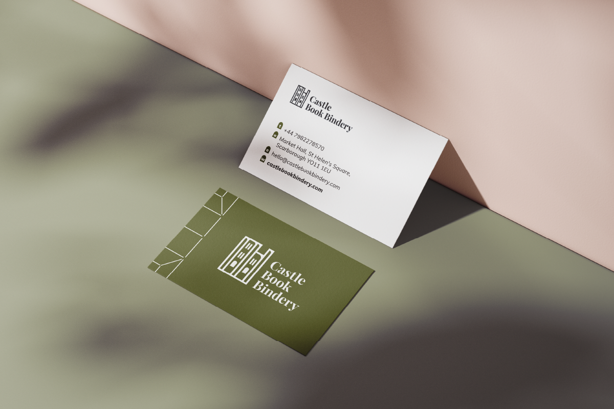
A small independent business based in Scarborough, North Yorkshire who restore books and create journals by hand using the finest materials and time-honoured traditional craft.
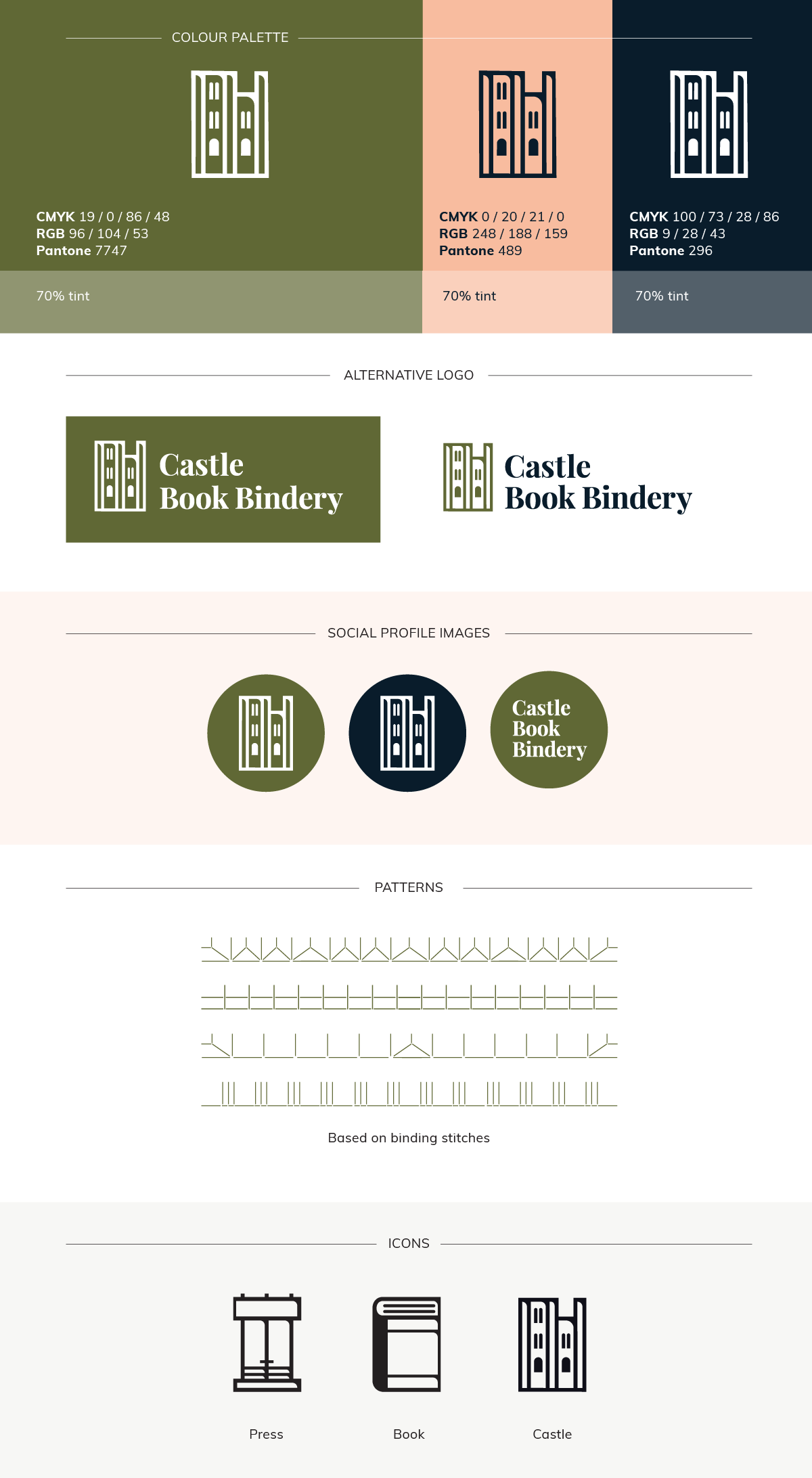
Work: Logo, branding
The concept: Blending modern and traditional elements to reflect the heritage of bookbinding while appealing to a younger audience. Offering a fresher, more relevant direction suitable for the new, younger owner. The castle mark is designed as a simple and memorable icon which echoes the character of letterpress printing. It remains intentionally ambiguous, doubling as the spines of books lined up on a shelf, reinforcing both craft and storytelling.