BrightSparks are a creative communications and business development agency who work exclusively with social purpose organisations.
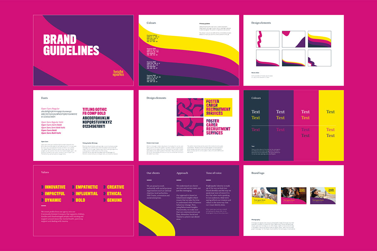
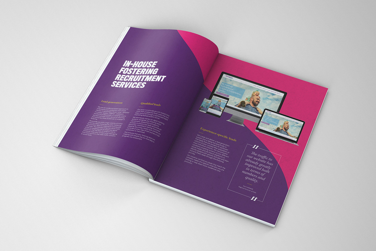
Work: Updated logo, branding and guidelines. For the brand launch, an animation was created.
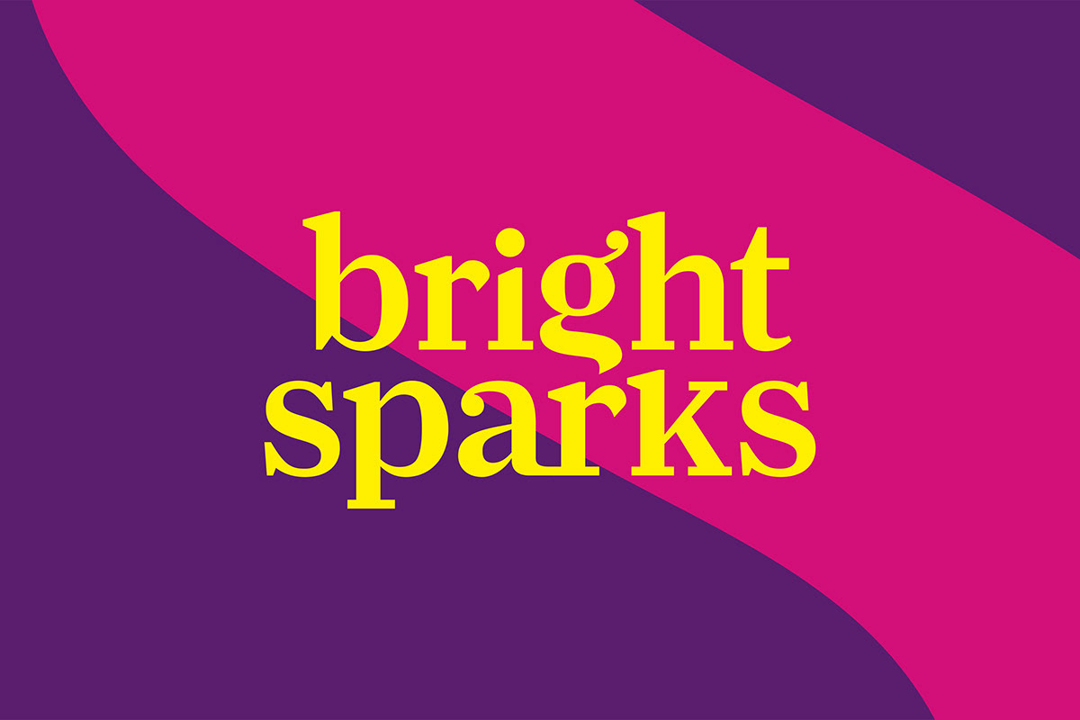
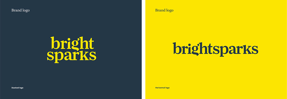
The concept: A simple and refined logo, infusing subtle personality through design details. The descending stroke of the letter g has been modified to fit harmoniously within the overall shape, which evokes both a wave (symbolizing change) and a flame (representing sparks and energy). This shape can be isolated and used within the branding. The chosen colour palette is bold, bright and impactful.