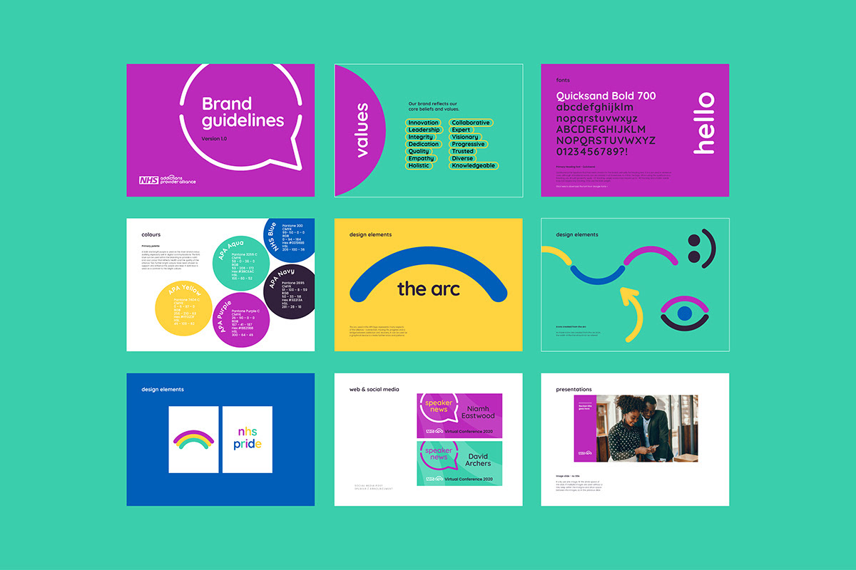
NHS APA work collaboratively with service users, carers and other organisations to make a positive difference within the addictions field.
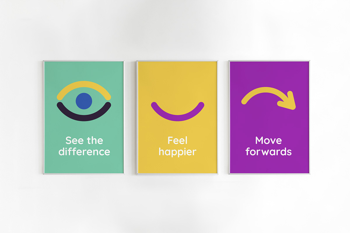
Work: Logo, branding, guidelines and an update of existing materials. An animation was created for the launch, to demonstrate all the elements of the new brand.
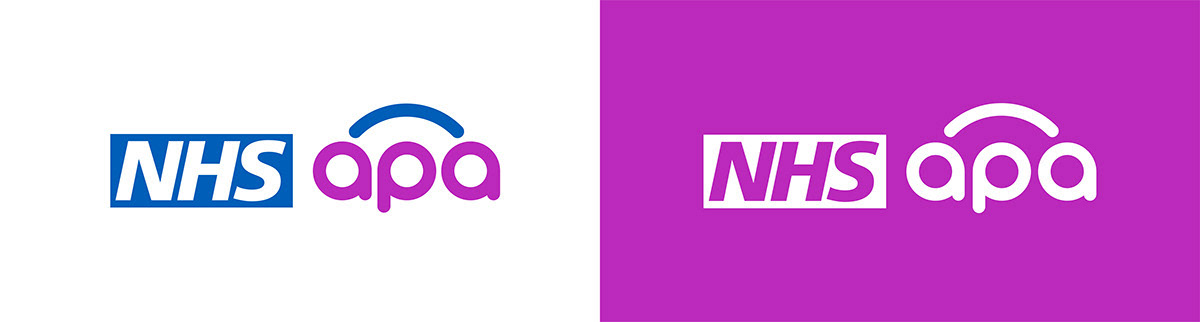
The concept: The remit and name of the alliance changed so they took the opportunity to freshen up their branding. The new design features a rounded typeface that feels approachable and compassionate, while a bright purple has been introduced to create a bold, modern contrast that complements the NHS blue. The arc icon adds a sense of movement and growth, and its placement subtly suggests two people connecting. The arc also symbolizes progress and forward momentum, serving as a bridge between addiction and recovery.